A whole new ‘hoo
Reimagining a legendary internet brand.
Role: Creative Director
Challenge
Shake off the serifs and bring back the joi de vivre.
Impact
Millions of Yahoo’s fist-pumped in their brand’s renewed commitment to cutting out the clutter and amplifying what matters most.
Outcome
An updated identity system that lives up to the master-brand strategy.
A brand is more than a logo and a color … the most inspired companies rally around a mission—a purpose in the world. Everything they do, including how they look and feel, should support their mission.
Yahoo’s mission is to keep the world interested and interesting, by giving people more of the things they love.

Brand character
Yahoo hangs with a bunch of tribes—sports fans, news junkies, finance freaks, pop culture mavens, the organization-obsessed ...
The brand dials its voice in for each unique conversation, but always embody three core characteristics — Generosity, Optimism and Enthusiasm.


Logo
A custom, geometric typeface with special attention given to the “bang” provided the foundation for a contemporary solution, sacrificing zero personality.

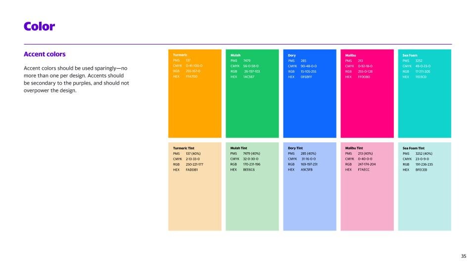
Color
Three shades of heritage purple form the core of our palette. A small but powerful collection of accents and tints compliment.

Typography
The workhorse of our communication, a bespoke, humanist typeface called Yahoo Sans comes in eight exciting weights that provide a wide range of tonalities and looks.


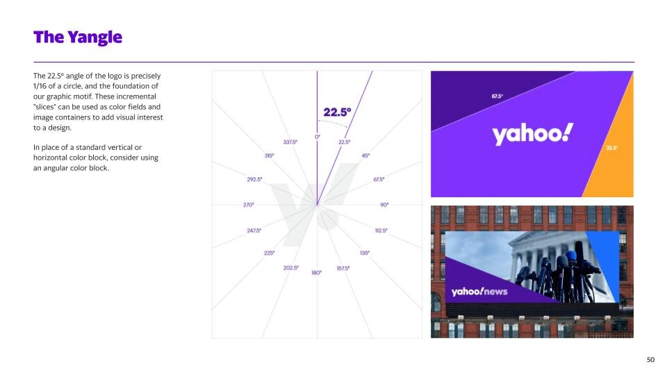
Grid
Our grid isn’t a grid. It’s a Yangle. When we divide a circle by the angle of our exclamation point, 22.5˚, we get eight even slices. These slices provide a scaffold for spotlighting a variety of subjects in a dynamic way.

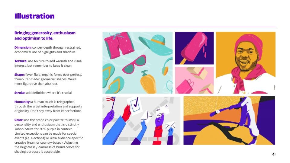
Illustration
Illustration gives a sense of the people on the other side. Our style flexes for subject and audience, but retains its Yahoo-ness across 2D and 3D by adhering to our limited palette, preference for clarity, and love for delight over cliché.

Motion
We want to create movement that conveys the emotive qualities of human interaction. Our motion theory flexes to generate an appropriate amount of personality while resolving to a Yahoo logo animation for consistency.


We want people to feel an exclamation point when they interact with Yahoo. So everything we do should be worthy of an exclamation point. Everything we write. Everything we design.